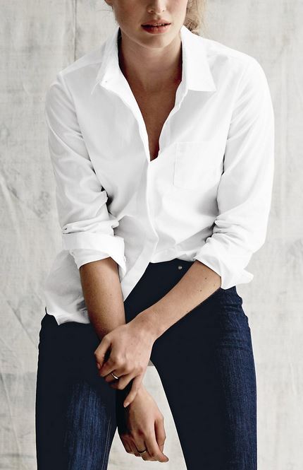
Nothing says ‘summer’s here!’ quite so emphatically as an all-white outfit, and as far as I am concerned the sooner the better!
Reading about the trends for spring and summer 2015, ‘all-white’ crops up regularly, perhaps thanks to Kim Kardashian, who is often seen head-to-toe in white. But it is not the easiest look to achieve.
Interior designers’ clients sometimes complain that a room looks ‘flat’. When asked to describe the room they will say, ‘Well, I have cream cotton sofas, cream wool carpet, matt cream-painted walls.’ The problem is not the similarity of colour. It is that the palette of materials is too similar: there is no variety in surface texture, translucency or scale of weave.
Kelly Hoppen, a designer who is famous for neutral schemes, achieves contrast within a constrained colour palette by mixing materials with very different light-reflecting properties: soft furnishings in linen, silk, suede, velvet and wool are placed next to sheer and translucent materials, as well as metals, stone and glass. The play of light across the surfaces of these materials – some absorbing light and others reflecting it – is what stimulates the eye and creates drama.
So what does that mean for the all-white fashion trend? Well, first of all you should make sure that your component parts are all exactly the same shade of white. Don’t mix bright white with winter white, ivory, or cream: the effect will be more washing machine accident than all-white palette. Then you should ensure that the components have distinct textural properties: some should be opaque and others sheer, some matt while their neighbours are shiny. But all in the same ‘white’ colour.
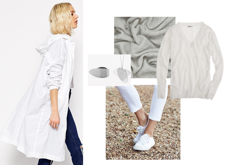
Quite the most striking white garment I have seen in the spring and summer 2015 collections is this semi-sheer parka from ASOS:
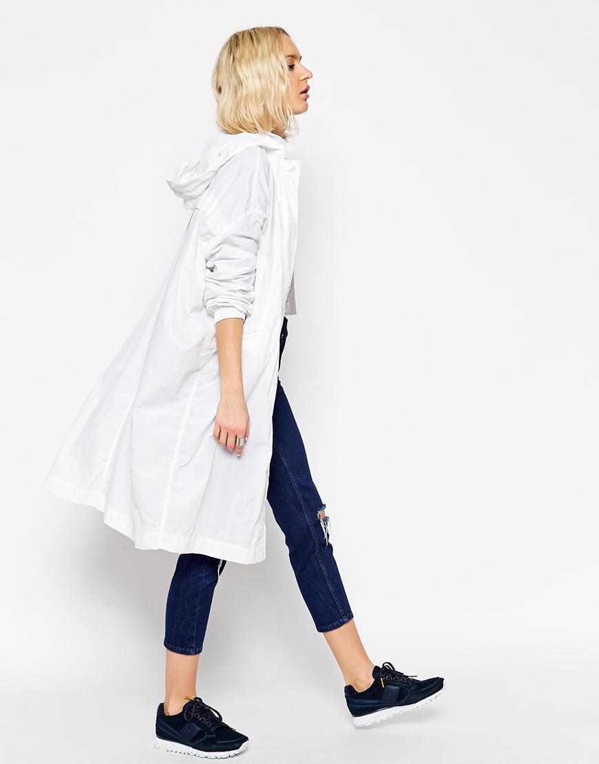
It is nylon, with a parachute-silky texture and volume. Generous in cut, and with great movement. And it packs into a small pouch which lends it a slightly ‘scrunched’ appearance.
It is a thin garment, so for the British spring I would pair it with a cashmere sweater from J Crew:

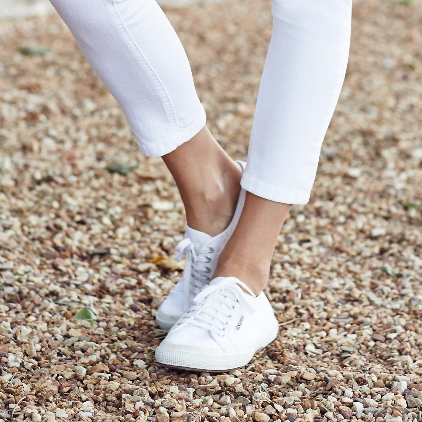
Soft, matt, and slightly fluffy, this long sweater is a great textural contrast to the nylon shell. White denim bottoms bring a distinctive diagonal twill weave. How about boyfriend jeans (reviewed with five stars on the White Company website) or these 7/8th jeans, paired with leather Superga plimsolls, whose leather introduces a more closed grain and reflective texture:
I’d be inclined to accessorise with silver-coloured metal. Cos has a lovely suite called ‘Contrast’, and I’m going for the ring and necklace set because their brushed metal surfaces have a subtle striation:

To break it up a bit more, I’d extend the introduction of silver to the remaining accessories, in this case the silver White Company cashmere scarf, with semi-sheer, soft matt, open weave: